
React Native Dropdown: 5 Ways to Build One in 2026

React Native has no dropdown component. Core ships TextInput, Switch and Modal, but nothing that renders a list of choices under a button. To build a dropdown in React Native you pick one of five routes: the native picker from @react-native-picker/picker, Expo UI's Picker, a JavaScript library such as react-native-element-dropdown, your own component built on Modal, or a component library's select, like HeroUI Native's Select.
They behave very differently on iOS and Android, and that difference is usually what decides it. Below is each option with working code for React Native 0.86 and Expo SDK 57, how screen readers handle it, and a table at the end to choose from.
Why there is no dropdown in core React Native
React Native used to ship a Picker in core. It was moved out to the community package @react-native-picker/picker years ago, along with other components the core team did not want to maintain. The reason is the same one that makes dropdowns awkward today: iOS and Android do not agree on what a "select" is.
On Android, the platform control is a spinner that opens a dialog or a menu anchored to the field. On iOS, the classic control is a wheel (UIPickerView) that sits inline in the layout, and newer apps use a pull-down menu from a button. A web-style dropdown, a box that expands into a list below it, exists on neither platform natively. Every "dropdown" you see in a React Native app is either one of those native controls or something drawn in JavaScript.
Option 1: @react-native-picker/picker (the native picker)
This is the package most tutorials mean by "react native picker". It wraps the platform control: a spinner on Android, a wheel on iOS.
npx expo install @react-native-picker/pickerimport { useState } from "react";
import { Picker } from "@react-native-picker/picker";
export function SizePicker() {
const [size, setSize] = useState("m");
return (
<Picker
selectedValue={size}
onValueChange={(value) => setSize(value)}
mode="dropdown"
prompt="Choose a size"
accessibilityLabel="Size"
>
<Picker.Item label="Small" value="s" />
<Picker.Item label="Medium" value="m" />
<Picker.Item label="Large" value="l" />
</Picker>
);
}The props that matter, from the library's README:
selectedValueandonValueChangemake it controlled. The callback receives(itemValue, itemIndex).modeis Android only:"dialog"(the default) opens a modal list,"dropdown"anchors the list to the field.promptis the title of the Android dialog.itemStylestyles the labels on iOS only. Most other styling props are Android only.- On Android you can open it from code with a ref:
pickerRef.current.focus().
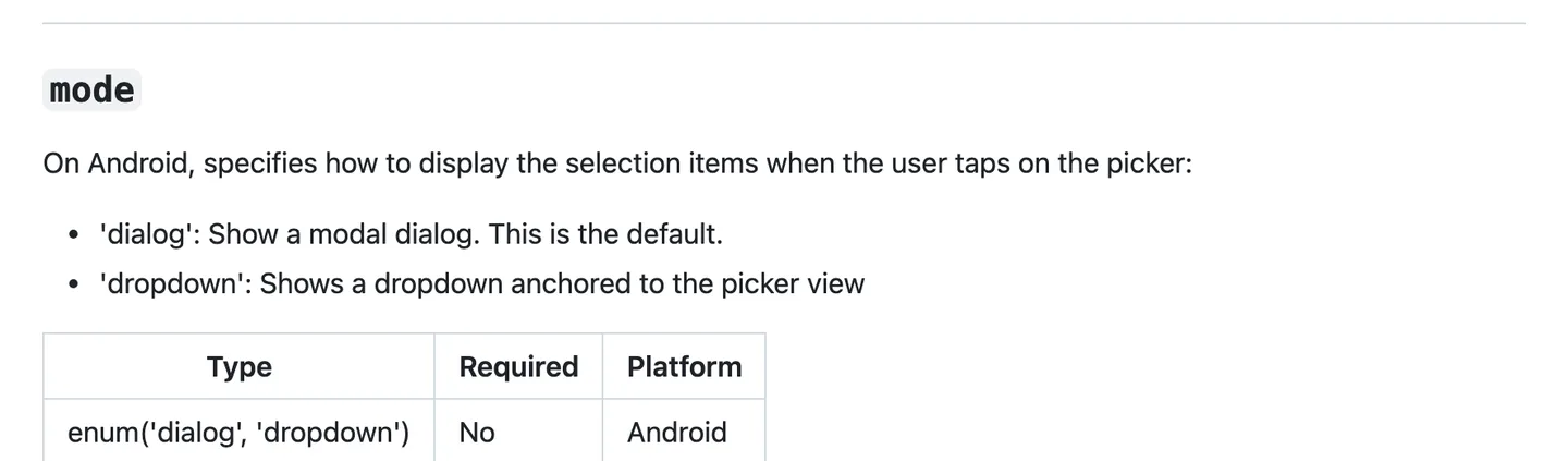
The mode prop only exists on Android. On iOS the picker is always a wheel. Source
That last point is the catch. Drop this component into a form and the iOS version is an always-visible wheel about 200 points tall, which is rarely what a designer means by "dropdown". The usual fix is to show the wheel inside a bottom sheet on iOS, which means you are building half of option 4 anyway.
Expo SDK 57 recommends version 2.11.4, and it runs in Expo Go. The package's last release on npm was in October 2025, so it is stable rather than active. Expo's own page for it now points to a replacement.
Option 2: Expo UI's Picker (SwiftUI and Jetpack Compose)
@expo/ui renders real SwiftUI views on iOS and Jetpack Compose views on Android. In SDK 57 it has a universal Picker that works on both platforms, plus a compatibility layer for the old picker's API.
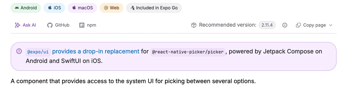
Expo's SDK 57 reference for the community picker points new code at @expo/ui. Source
The universal one is the interesting one. Its default appearance="menu" is a compact button that opens a native popup menu on iOS and a Material 3 dropdown on Android, which is much closer to what people mean by a dropdown menu in React Native.
npx expo install @expo/uiimport { useState } from "react";
import { Host, Picker } from "@expo/ui";
export function FlavorPicker() {
const [flavor, setFlavor] = useState("vanilla");
return (
<Host matchContents={{ vertical: true }} style={{ width: "100%" }}>
<Picker selectedValue={flavor} onValueChange={setFlavor}>
<Picker.Item label="Vanilla" value="vanilla" />
<Picker.Item label="Chocolate" value="chocolate" />
<Picker.Item label="Strawberry" value="strawberry" />
</Picker>
</Host>
);
}Two things to know. Every Expo UI component has to sit inside a Host, which is the bridge between React Native layout and the native view tree; inside it, Flexbox styles stop applying. And appearance="wheel" gives you the iOS rotor, falling back to the dropdown on Android, per the universal Picker docs.
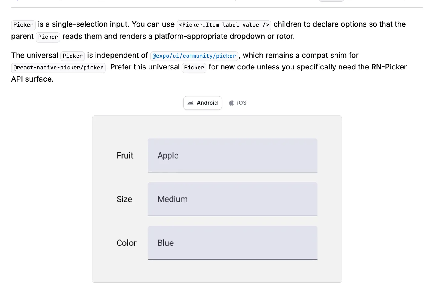
The universal Picker is the one Expo suggests for new code; @expo/ui/community/picker is a compat shim. Source
If you are migrating, import { Picker } from "@expo/ui/community/picker" keeps the selectedValue and Picker.Item API, but the drop-in page lists props it ignores, including mode, prompt, itemStyle and accessibilityLabel. If you need iOS pull-down menus with actions rather than a value picker, Expo UI also has Menu on SwiftUI and DropdownMenu on Compose.
Option 3: a JavaScript dropdown library
If you want the same dropdown on both platforms, with search or multi-select, a JS library draws it for you. The popular ones, with their last npm release as of October 2026:
| Library | Last release | Weekly downloads | Notes |
|---|---|---|---|
| react-native-element-dropdown | 2.12.4, Jan 2025 | about 184,000 | Search, multi-select, modal mode |
| react-native-dropdown-picker | 5.4.6, Mar 2023 | about 185,000 | No release in over three years |
| react-native-select-dropdown | 4.0.1, Apr 2024 | about 47,000 | Fully custom rendering |
Release dates are from the npm registry and download counts from npm's downloads API, for the week ending October 1, 2026. All three are pure JavaScript, so they work in Expo Go, and all three are effectively in maintenance mode. Of the three, react-native-element-dropdown is the one we would pick: it was released most recently, and it has accessibilityLabel for the field plus an itemAccessibilityLabelField for each option.
npx expo install react-native-element-dropdownimport { useState } from "react";
import { Dropdown } from "react-native-element-dropdown";
const COUNTRIES = [
{ label: "Germany", value: "de" },
{ label: "United Kingdom", value: "uk" },
{ label: "United States", value: "us" },
];
export function CountryDropdown() {
const [country, setCountry] = useState<string | null>(null);
return (
<Dropdown
data={COUNTRIES}
labelField="label"
valueField="value"
value={country}
onChange={(item) => setCountry(item.value)}
placeholder="Select a country"
search
searchPlaceholder="Search"
maxHeight={300}
accessibilityLabel="Country"
style={{ borderWidth: 1, borderColor: "#d4d4d8", borderRadius: 10, padding: 12 }}
/>
);
}labelField and valueField tell it which keys of your objects to read, and onChange hands you the whole item. For multiple choices, the same package exports MultiSelect, whose value is an array.
Option 4: build an accessible custom dropdown with Modal
For a handful of options, writing your own is about 80 lines, has no dependency, and looks the same on both platforms. Modal gives you the overlay and the Android back button (through onRequestClose), and it presents above the rest of the screen, so a screen reader moves into the list while it is open.
import { useState } from "react";
import { FlatList, Modal, Pressable, StyleSheet, Text, View } from "react-native";

type Option = { label: string; value: string };

type DropdownProps = {
  label: string;
  options: Option[];
  value: string | null;
  onChange: (value: string) => void;
  placeholder?: string;
};

export function Dropdown({ label, options, value, onChange, placeholder = "Select" }: DropdownProps) {
  const [open, setOpen] = useState(false);
  const selected = options.find((option) => option.value === value);

  return (
    <View style={styles.field}>
      <Text style={styles.label}>{label}</Text>

      <Pressable
        onPress={() => setOpen(true)}
        accessibilityRole="button"
        accessibilityLabel={`${label}, ${selected ? selected.label : "nothing selected"}`}
        accessibilityHint="Opens a list of options"
        accessibilityState={{ expanded: open }}
        style={styles.trigger}
      >
        <Text style={selected ? styles.value : styles.placeholder}>
          {selected ? selected.label : placeholder}
        </Text>
        <Text style={styles.chevron}>▾</Text>
      </Pressable>

      <Modal
        visible={open}
        transparent
        animationType="fade"
        onRequestClose={() => setOpen(false)}
      >
        <View style={styles.overlay}>
          {/* Backdrop as a sibling, so taps on the list do not close it */}
          <Pressable
            style={StyleSheet.absoluteFill}
            onPress={() => setOpen(false)}
            accessibilityRole="button"
            accessibilityLabel="Close list"
          />
          <View style={styles.sheet}>
            <Text style={styles.sheetTitle} accessibilityRole="header">
              {label}
            </Text>
            <FlatList
              data={options}
              keyExtractor={(option) => option.value}
              renderItem={({ item }) => {
                const isSelected = item.value === value;
                return (
                  <Pressable
                    onPress={() => {
                      onChange(item.value);
                      setOpen(false);
                    }}
                    accessibilityRole="button"
                    accessibilityState={{ selected: isSelected }}
                    style={({ pressed }) => [styles.option, pressed && styles.optionPressed]}
                  >
                    <Text style={[styles.optionText, isSelected && styles.optionSelected]}>
                      {item.label}
                    </Text>
                    {isSelected ? <Text style={styles.optionSelected}>✓</Text> : null}
                  </Pressable>
                );
              }}
            />
          </View>
        </View>
      </Modal>
    </View>
  );
}

const styles = StyleSheet.create({
  field: { gap: 6 },
  label: { fontSize: 14, fontWeight: "600", color: "#3f3f46" },
  trigger: {
    flexDirection: "row",
    alignItems: "center",
    justifyContent: "space-between",
    minHeight: 48,
    paddingHorizontal: 14,
    borderWidth: 1,
    borderColor: "#d4d4d8",
    borderRadius: 10,
  },
  value: { fontSize: 16, color: "#18181b" },
  placeholder: { fontSize: 16, color: "#a1a1aa" },
  chevron: { fontSize: 16, color: "#71717a" },
  overlay: {
    flex: 1,
    justifyContent: "center",
    padding: 24,
    backgroundColor: "rgba(0, 0, 0, 0.4)",
  },
  sheet: { maxHeight: "60%", borderRadius: 16, backgroundColor: "#fff", paddingVertical: 8 },
  sheetTitle: { fontSize: 13, fontWeight: "600", color: "#71717a", padding: 16, paddingBottom: 8 },
  option: {
    flexDirection: "row",
    justifyContent: "space-between",
    minHeight: 48,
    alignItems: "center",
    paddingHorizontal: 16,
  },
  optionPressed: { backgroundColor: "#f4f4f5" },
  optionText: { fontSize: 16, color: "#18181b" },
  optionSelected: { fontWeight: "600", color: "#2563eb" },
});
Use it like any controlled input:
const [country, setCountry] = useState<string | null>(null);

<Dropdown
  label="Country"
  options={COUNTRIES}
  value={country}
  onChange={setCountry}
  placeholder="Select a country"
/>
A few choices in there are deliberate:
- The backdrop is a sibling of the card, not its parent. If the card sat inside the backdrop
Pressable, a tap on a non-pressable part of the card would close the list. - The trigger's
accessibilityLabelincludes the current value, so VoiceOver and TalkBack read "Country, Germany" instead of just "Country".accessibilityState.expandedexposes whether the list is open. - Each option reports
selected, so a screen reader user hears which one is current. - Rows are at least 48 points tall, which meets Android's touch target guidance and clears Apple's 44 point minimum.
React Native's role prop also accepts combobox, menu and menuitem (accessibility docs), and they map to different native traits on iOS and Android. A button with an expanded state and the value in its label is the conservative choice; whichever you pick, test it with VoiceOver and TalkBack turned on.
If you would rather slide the list up from the bottom, swap the centered card for a bottom sheet. @gorhom/bottom-sheet is the common choice, and the component library below has one built in.
Option 5: HeroUI Native's Select (the component library route)
If your app already uses a component library, use its select so the dropdown matches your inputs and buttons. We use HeroUI Native in the NativeExpress React Native starter kit, styled with Uniwind (Tailwind CSS for React Native). Its Select is a compound component: you compose the trigger, the value and the list from parts.
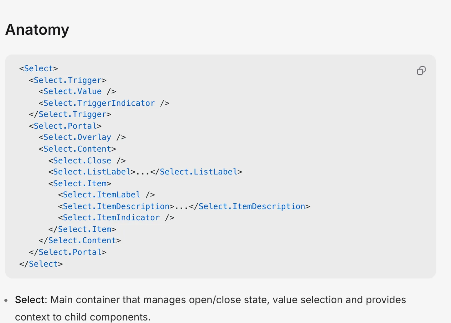
The Select anatomy from HeroUI Native's docs. Every part takes a Tailwind className. Source
import { Select } from "heroui-native";
import { useState } from "react";

type SelectOption = { value: string; label: string };

const PLANS: SelectOption[] = [
  { value: "monthly", label: "Monthly" },
  { value: "yearly", label: "Yearly" },
  { value: "lifetime", label: "Lifetime" },
];

export function PlanSelect() {
  const [plan, setPlan] = useState<SelectOption | undefined>();

  return (
    <Select value={plan} onValueChange={setPlan}>
      <Select.Trigger>
        <Select.Value placeholder="Choose a plan" />
        <Select.TriggerIndicator />
      </Select.Trigger>
      <Select.Portal>
        <Select.Overlay />
        <Select.Content presentation="popover" width="trigger">
          {PLANS.map((option) => (
            <Select.Item key={option.value} value={option.value} label={option.label} />
          ))}
        </Select.Content>
      </Select.Portal>
    </Select>
  );
}
Things that trip people up:
- The value is an object with
valueandlabel, not a plain string. Store the object, or map it back to the string when you save. presentationcan be"popover"(floating under the trigger),"bottom-sheet"or"dialog". Set it on bothSelectandSelect.Contentwhen you change it.width="trigger"makes the popover match the field's width, which is what a dropdown usually looks like.- The app has to be wrapped in
HeroUINativeProviderinside aGestureHandlerRootView, per the quick start.
HeroUI Native is at version 1.0.10 as of October 2026. The trade-off is weight: it pulls in Reanimated, Gesture Handler and Uniwind. If you already have those (most Expo apps do), the select costs you nothing extra. If you are coming from the web, the compound API will feel like Radix or shadcn's select, even though neither runs in React Native; React vs React Native covers what does and does not carry over.
iOS vs Android: what each option looks like
| iOS | Android | Expo Go | Search / multi-select | |
|---|---|---|---|---|
@react-native-picker/picker | Inline wheel | Dialog or anchored spinner | Yes | No |
Expo UI Picker | Native menu or wheel | Material 3 dropdown | Yes | No |
react-native-element-dropdown | JS list, same on both | JS list, same on both | Yes | Yes |
Custom Modal dropdown | Your design | Your design | Yes | If you add it |
HeroUI Native Select | Popover, sheet or dialog | Popover, sheet or dialog | Yes | Custom item content, no search |
Which one should you use?
- A settings screen or a short form where native feel matters: Expo UI's
Picker. It is maintained with the SDK and the menu appearance looks right on both platforms. - Long lists, search, or multi-select:
react-native-element-dropdown, accepting that it is in maintenance mode, or HeroUI'sSelectif you use the library. - A design system you control: the custom
Modalcomponent above, or your component library's select. - An existing app already on
@react-native-picker/picker: keep it, and plan a move to@expo/ui/community/pickerwhen you next touch the form.
If your dropdown sits in a form, the text fields around it need the same care. Our React Native TextInput guide covers keyboard types, keyboard avoidance and validating the whole form with React Hook Form and Zod.
FAQ
Does React Native have a built-in dropdown?
No. Core React Native has no dropdown or select component. The old Picker was moved out to @react-native-picker/picker, and Expo SDK 57 adds a native Picker in @expo/ui. Everything else is a JavaScript library or your own component.
What is the best dropdown library for React Native?
For native controls, @expo/ui's Picker if you are on Expo, or @react-native-picker/picker otherwise. For a JavaScript dropdown with search and multi-select, react-native-element-dropdown is the most used and the most recently released of the popular options, though its last release was in January 2025.
How do I make a dropdown menu in React Native without a library?
Use Modal with transparent and onRequestClose, a Pressable trigger that opens it, and a FlatList of Pressable options inside. The full component is in option 4 above, including the accessibility props.
Why does my React Native picker look like a wheel on iOS?
Because @react-native-picker/picker renders UIPickerView on iOS, which is an inline wheel. The mode="dropdown" prop only affects Android. For a compact dropdown on iOS, use Expo UI's Picker with the default menu appearance, or show the wheel inside a bottom sheet.