
React Native Text Input: Props, Textarea and Forms

To create a text input in React Native, import TextInput from react-native, keep its text in state, and pass that state back through value while updating it in onChangeText. That gives you a controlled text field. Props such as keyboardType, autoComplete, secureTextEntry and multiline turn the same component into an email field, a password field or a textarea.
This guide covers the props you will actually use, a textarea that behaves the same on iOS and Android, keeping the keyboard from covering your fields, and a full form validated with React Hook Form and Zod. The code targets React Native 0.86 and Expo SDK 57. At the end we show the same field built with Uniwind classes and with HeroUI Native's TextField.
A controlled TextInput
TextInput is one of React Native's core components, so there is nothing to install. The minimal version:
import { useState } from "react";
import { StyleSheet, Text, TextInput, View } from "react-native";

export function NameField() {
  const [name, setName] = useState("");

  return (
    <View style={styles.field}>
      <Text style={styles.label}>Full name</Text>
      <TextInput
        value={name}
        onChangeText={setName}
        placeholder="Ada Lovelace"
        accessibilityLabel="Full name"
        style={styles.input}
      />
    </View>
  );
}

const styles = StyleSheet.create({
  field: { gap: 6 },
  label: { fontSize: 14, fontWeight: "600" },
  input: {
    minHeight: 48,
    paddingHorizontal: 14,
    borderWidth: 1,
    borderColor: "#d4d4d8",
    borderRadius: 10,
    fontSize: 16,
  },
});
onChangeText receives the new string. There is also onChange, which receives a native event, but you rarely need it. If you come from React on the web, this replaces <input value onChange> and event.target.value; our React vs React Native post lists the other swaps.
Two habits worth having from the first field. Give the input an accessibilityLabel (a visible Text above it is not linked to it for screen readers the way an HTML <label> is). And use minHeight instead of height, so text still fits when the user has a large font size set.
React Native TextInput props you will use
The TextInput reference lists around 70 props and methods, plus everything View accepts. These are the ones that show up in almost every app:
| Prop | What it does | Typical values |
|---|---|---|
keyboardType | Which keyboard opens | "email-address", "number-pad", "phone-pad", "decimal-pad", "url" |
autoComplete | Autofill hint, both platforms | "email", "current-password", "new-password", "one-time-code", "name", "tel" |
textContentType | iOS-only autofill hint | "emailAddress", "password", "oneTimeCode" |
secureTextEntry | Hides the text | true for passwords |
autoCapitalize | Capitalization | "none" for emails and usernames |
autoCorrect | Spelling correction | false for emails, codes, usernames |
returnKeyType | Label on the return key | "next", "done", "go", "search", "send" |
submitBehavior | What return does | "submit", "blurAndSubmit", "newline" |
maxLength | Hard character limit | a number |
multiline | Several lines (a textarea) | true |
editable / readOnly | Lock the field | false / true |
On autofill: the docs say to avoid setting both textContentType and autoComplete, because textContentType wins on iOS when both are set. autoComplete covers both platforms, so use it alone unless you need an iOS-only value.
Here is an email and password pair that autofills from the password manager, moves to the password field when you press "next", and submits on "go":
import { useRef, useState } from "react";
import { TextInput, View } from "react-native";

export function SignInFields({ onSubmit }: { onSubmit: (email: string, password: string) => void }) {
  const [email, setEmail] = useState("");
  const [password, setPassword] = useState("");
  const passwordRef = useRef<TextInput>(null);

  return (
    <View style={{ gap: 12 }}>
      <TextInput
        value={email}
        onChangeText={setEmail}
        placeholder="you@example.com"
        accessibilityLabel="Email"
        keyboardType="email-address"
        autoComplete="email"
        autoCapitalize="none"
        autoCorrect={false}
        returnKeyType="next"
        submitBehavior="submit"
        onSubmitEditing={() => passwordRef.current?.focus()}
      />
      <TextInput
        ref={passwordRef}
        value={password}
        onChangeText={setPassword}
        placeholder="Password"
        accessibilityLabel="Password"
        secureTextEntry
        autoComplete="current-password"
        returnKeyType="go"
        onSubmitEditing={() => onSubmit(email, password)}
      />
    </View>
  );
}
submitBehavior="submit" on the email field fires onSubmitEditing without blurring, so the keyboard stays up while focus moves to the password. You will still see blurOnSubmit in older tutorials. It is deprecated.
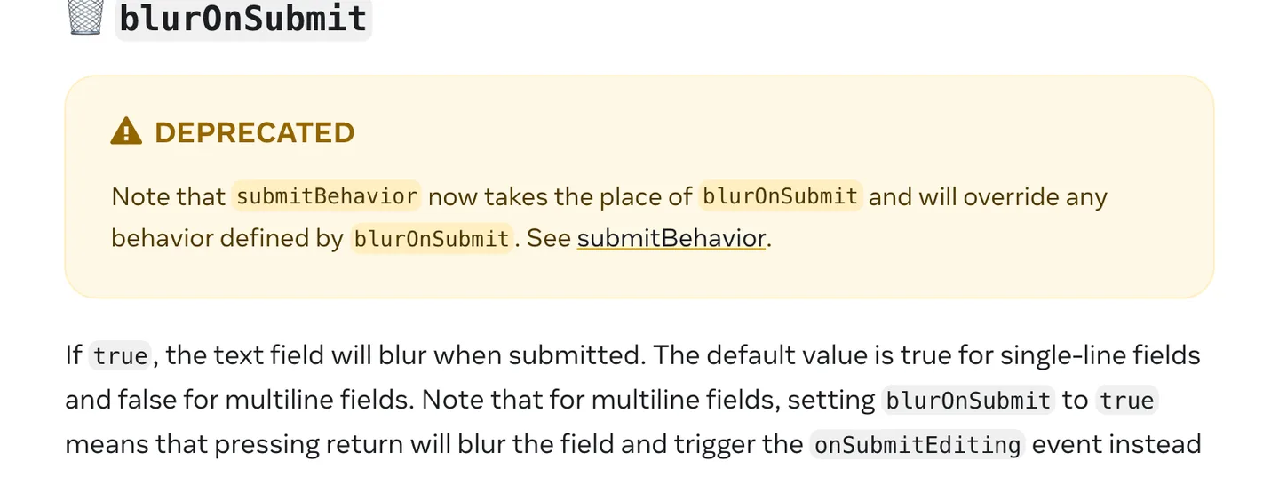
submitBehavior replaced blurOnSubmit and overrides it when both are set. Source
For a sign-up form, switch the password to autoComplete="new-password" so iOS and Android offer to generate and save a strong one. For SMS codes, autoComplete="one-time-code" with keyboardType="number-pad" lets the system fill the code from the message.
Text area in React Native: multiline input
There is no separate <textarea>. A textarea in React Native is a TextInput with multiline. The part that catches everyone is vertical alignment.
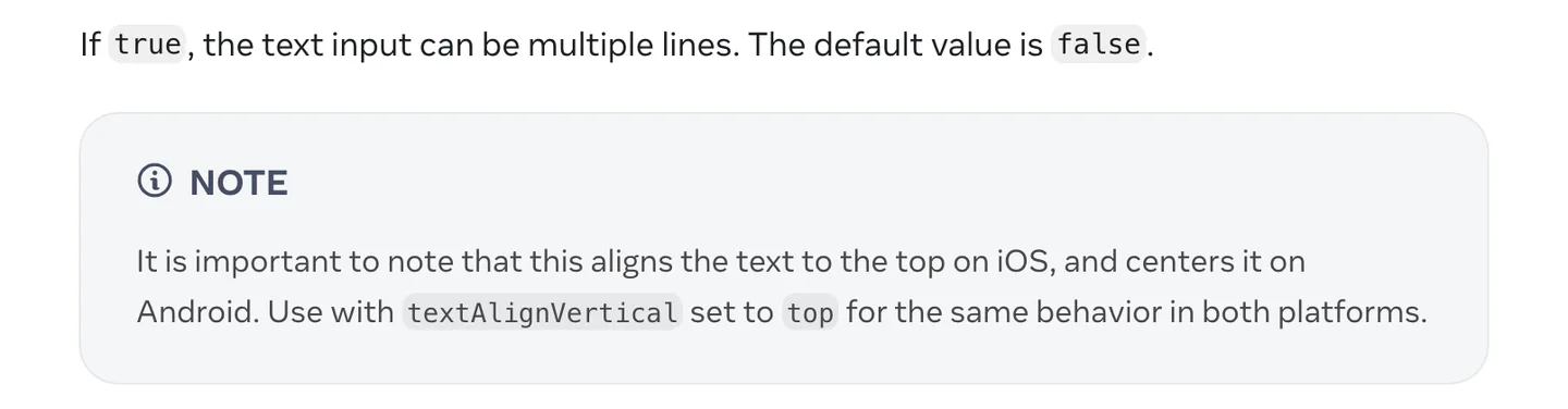
Without textAlignVertical: "top", an Android textarea starts typing in the middle of the box. Source
A textarea with a character counter:
import { useState } from "react";
import { StyleSheet, Text, TextInput, View } from "react-native";

const MAX = 500;

export function FeedbackField() {
  const [text, setText] = useState("");

  return (
    <View style={{ gap: 6 }}>
      <TextInput
        value={text}
        onChangeText={setText}
        placeholder="What should we improve?"
        accessibilityLabel="Feedback"
        multiline
        numberOfLines={5}
        maxLength={MAX}
        textAlignVertical="top"
        style={styles.textarea}
      />
      <Text style={styles.counter} accessibilityLiveRegion="polite">
        {text.length} / {MAX}
      </Text>
    </View>
  );
}

const styles = StyleSheet.create({
  textarea: {
    minHeight: 120,
    maxHeight: 240,
    padding: 14,
    borderWidth: 1,
    borderColor: "#d4d4d8",
    borderRadius: 10,
    fontSize: 16,
  },
  counter: { alignSelf: "flex-end", fontSize: 12, color: "#71717a" },
});
minHeight sets the starting size, and maxHeight stops the box from growing past a point, after which it scrolls. numberOfLines sets the maximum number of lines; on iOS it only works on the New Architecture, which is the only architecture in React Native 0.86 anyway. In a multiline field, return inserts a newline by default. If you want return to send (a chat composer, for example), set submitBehavior="submit" and handle onSubmitEditing.
Keeping the keyboard from covering your fields
The keyboard does not move your layout out of the way by itself. React Native gives you KeyboardAvoidingView, and Expo's keyboard handling guide suggests padding on iOS and no behavior on Android:
import { KeyboardAvoidingView, Platform } from "react-native";

<KeyboardAvoidingView
  behavior={Platform.OS === "ios" ? "padding" : undefined}
  style={{ flex: 1 }}
>
  {/* your fields */}
</KeyboardAvoidingView>
That is fine for a screen with one or two fields near the top. For real forms, the same guide recommends react-native-keyboard-controller, which scrolls the focused input into view and behaves the same on both platforms.
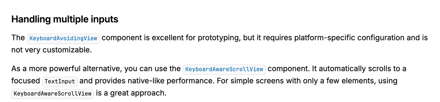
Expo's guide: KeyboardAvoidingView for prototypes, KeyboardAwareScrollView for forms. Source
npx expo install react-native-keyboard-controllerWrap the app once, in your root layout:
// app/_layout.tsx
import { Stack } from "expo-router";
import { KeyboardProvider } from "react-native-keyboard-controller";

export default function RootLayout() {
  return (
    <KeyboardProvider>
      <Stack />
    </KeyboardProvider>
  );
}
Then use KeyboardAwareScrollView where you would use a ScrollView:
import { KeyboardAwareScrollView } from "react-native-keyboard-controller";

<KeyboardAwareScrollView
  bottomOffset={24}
  keyboardShouldPersistTaps="handled"
  contentContainerStyle={{ padding: 16, gap: 16 }}
>
  {/* fields and a submit button */}
</KeyboardAwareScrollView>
bottomOffset is the gap kept between the focused field and the keyboard. keyboardShouldPersistTaps="handled" lets a tap on the submit button register while the keyboard is open, instead of only dismissing it. The library needs Reanimated and is not in Expo Go, so you need a development build. If bottom tabs jump above the keyboard on Android, Expo's guide suggests "softwareKeyboardLayoutMode": "pan" under android in your app config, or tabBarHideOnKeyboard: true on the tab navigator.
Forms with validation: React Hook Form and Zod
Managing every field with its own useState gets messy past three fields. React Hook Form tracks values, touched state and errors, and Zod describes the rules once. Versions as of October 2026: react-hook-form 7.89, @hookform/resolvers 5.9 and zod 4.6.
npx expo install react-hook-form @hookform/resolvers zodReact Native has no <input> for React Hook Form's register to attach to, so each field goes through a Controller:
import { zodResolver } from "@hookform/resolvers/zod";
import { Controller, useForm } from "react-hook-form";
import { Pressable, Text, TextInput, View } from "react-native";
import { z } from "zod";

const schema = z.object({
  email: z.email("Enter a valid email address"),
  password: z.string().min(8, "Use at least 8 characters"),
});

type SignUpValues = z.infer<typeof schema>;

export function SignUpForm({ onSignUp }: { onSignUp: (values: SignUpValues) => Promise<void> }) {
  const {
    control,
    handleSubmit,
    formState: { errors, isSubmitting },
  } = useForm({
    resolver: zodResolver(schema),
    defaultValues: { email: "", password: "" },
  });

  return (
    <View style={{ gap: 16 }}>
      <Controller
        control={control}
        name="email"
        render={({ field: { onChange, onBlur, value, ref } }) => (
          <TextInput
            ref={ref}
            value={value}
            onChangeText={onChange}
            onBlur={onBlur}
            placeholder="you@example.com"
            accessibilityLabel="Email"
            keyboardType="email-address"
            autoComplete="email"
            autoCapitalize="none"
            autoCorrect={false}
          />
        )}
      />
      {errors.email ? (
        <Text role="alert" accessibilityLiveRegion="polite" style={{ color: "#dc2626" }}>
          {errors.email.message}
        </Text>
      ) : null}

      <Controller
        control={control}
        name="password"
        render={({ field: { onChange, onBlur, value, ref } }) => (
          <TextInput
            ref={ref}
            value={value}
            onChangeText={onChange}
            onBlur={onBlur}
            placeholder="Password"
            accessibilityLabel="Password"
            secureTextEntry
            autoComplete="new-password"
          />
        )}
      />
      {errors.password ? (
        <Text role="alert" accessibilityLiveRegion="polite" style={{ color: "#dc2626" }}>
          {errors.password.message}
        </Text>
      ) : null}

      <Pressable
        onPress={handleSubmit(onSignUp)}
        disabled={isSubmitting}
        accessibilityRole="button"
        accessibilityState={{ disabled: isSubmitting }}
      >
        <Text>{isSubmitting ? "Creating account" : "Create account"}</Text>
      </Pressable>
    </View>
  );
}
What each piece does:
zodResolver(schema)runs the Zod schema on submit and maps its messages ontoerrors. Leaving the generic offuseFormlets it infer the types from the resolver.z.email()is the Zod 4 form;z.string().email()still works but is deprecated.- Passing
refto theTextInputlets React Hook Form focus the first invalid field when submit fails. handleSubmit(onSignUp)returns a function, which is why it goes straight intoonPress. It only callsonSignUpwhen validation passes, andisSubmittingstays true while your promise runs.role="alert"andaccessibilityLiveRegionmake TalkBack and VoiceOver announce the error when it appears.
By default React Hook Form validates on submit, then re-validates a field as it changes. Pass mode: "onBlur" to useForm if you want errors as soon as the user leaves a field.
Styling: StyleSheet or Tailwind classes with Uniwind
Everything above uses StyleSheet, which ships with React Native and needs no setup. If you prefer Tailwind, Uniwind brings Tailwind CSS v4 to React Native and adds className to core components. Style props become classes, and color props that are not styles (placeholder, cursor, selection) get their own ...ClassName props with an accent- prefix.
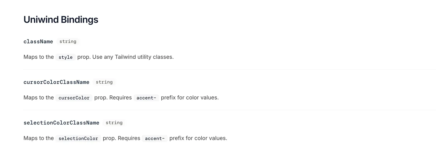
Uniwind maps className to style, and color props to accent- classes. Source
import { TextInput } from "react-native";

<TextInput
  value={email}
  onChangeText={setEmail}
  placeholder="you@example.com"
  accessibilityLabel="Email"
  className="min-h-12 rounded-xl border border-zinc-300 bg-white px-4 text-base text-zinc-900 dark:border-zinc-700 dark:bg-zinc-900 dark:text-white"
  placeholderTextColorClassName="accent-zinc-400 dark:accent-zinc-500"
  selectionColorClassName="accent-blue-500"
/>
The trade-off is the usual one. StyleSheet has no build step and no surprises. Classes keep the style next to the markup and pick up dark mode and your theme tokens, which matters once you have twenty forms instead of two. NativeExpress uses Uniwind, so light and dark themes generated from one seed color reach every input without a hand-edited stylesheet.
HeroUI Native's TextField
A component library saves you the label, helper text and error wiring. HeroUI Native splits a field into parts: TextField holds the state, and Label, Input, Description and FieldError read it.
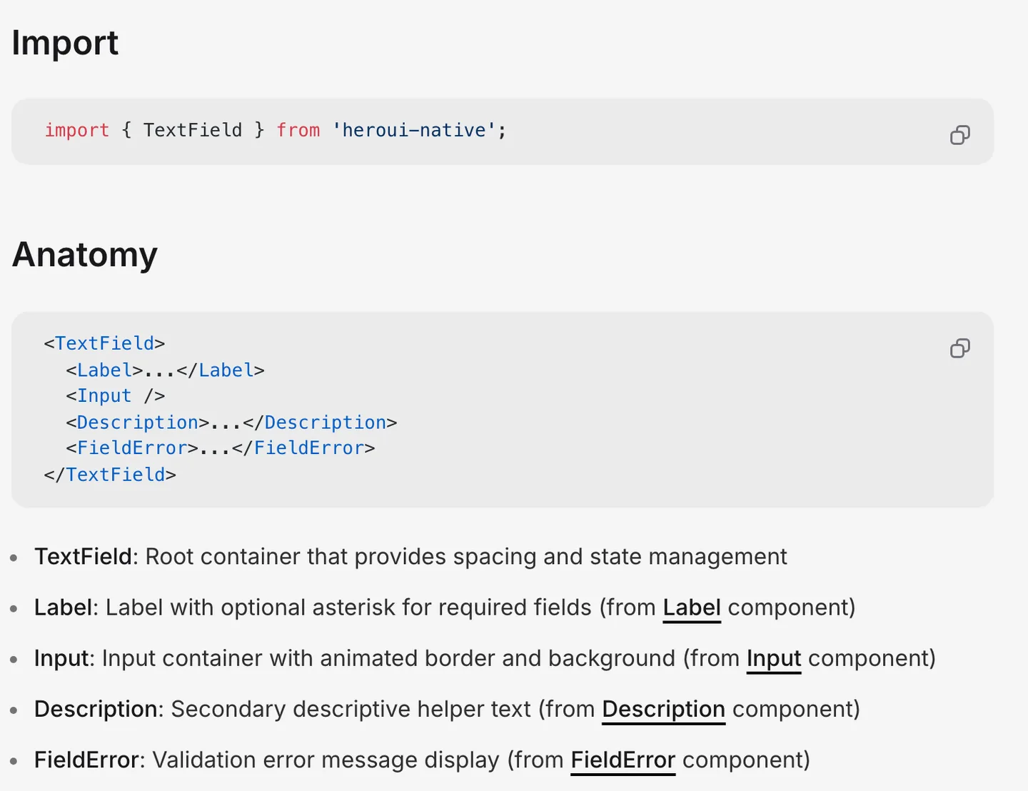
TextField passes isInvalid, isRequired and isDisabled down to its parts. Source
The email field from the form above, rebuilt with it:
import { Controller } from "react-hook-form";
import { FieldError, Input, Label, TextField } from "heroui-native";

<Controller
  control={control}
  name="email"
  render={({ field: { onChange, onBlur, value }, fieldState: { error } }) => (
    <TextField isRequired isInvalid={!!error}>
      <Label>Email</Label>
      <Input
        value={value}
        onChangeText={onChange}
        onBlur={onBlur}
        placeholder="you@example.com"
        keyboardType="email-address"
        autoComplete="email"
        autoCapitalize="none"
      />
      <FieldError>{error?.message}</FieldError>
    </TextField>
  )}
/>
Input accepts every TextInput prop, so everything earlier in this post still applies. isRequired adds the asterisk to the label, and isInvalid switches the border and shows FieldError. For a textarea, swap Input for TextArea, which is the same component with multiline on and text aligned to the top, which solves the Android centering problem for you. Inside HeroUI's BottomSheet, inputs handle the keyboard themselves through the isBottomSheetAware prop, which defaults to true.
Here is what that looks like in a finished app, from the NativeExpress demo:
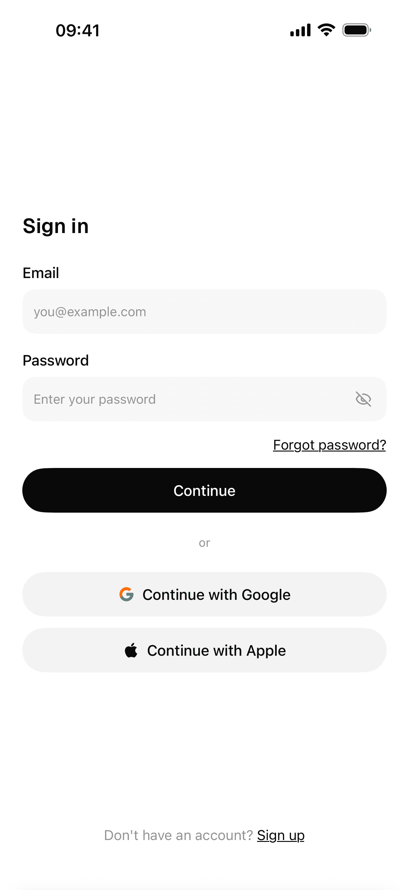
Sign-in with Google, Apple and email
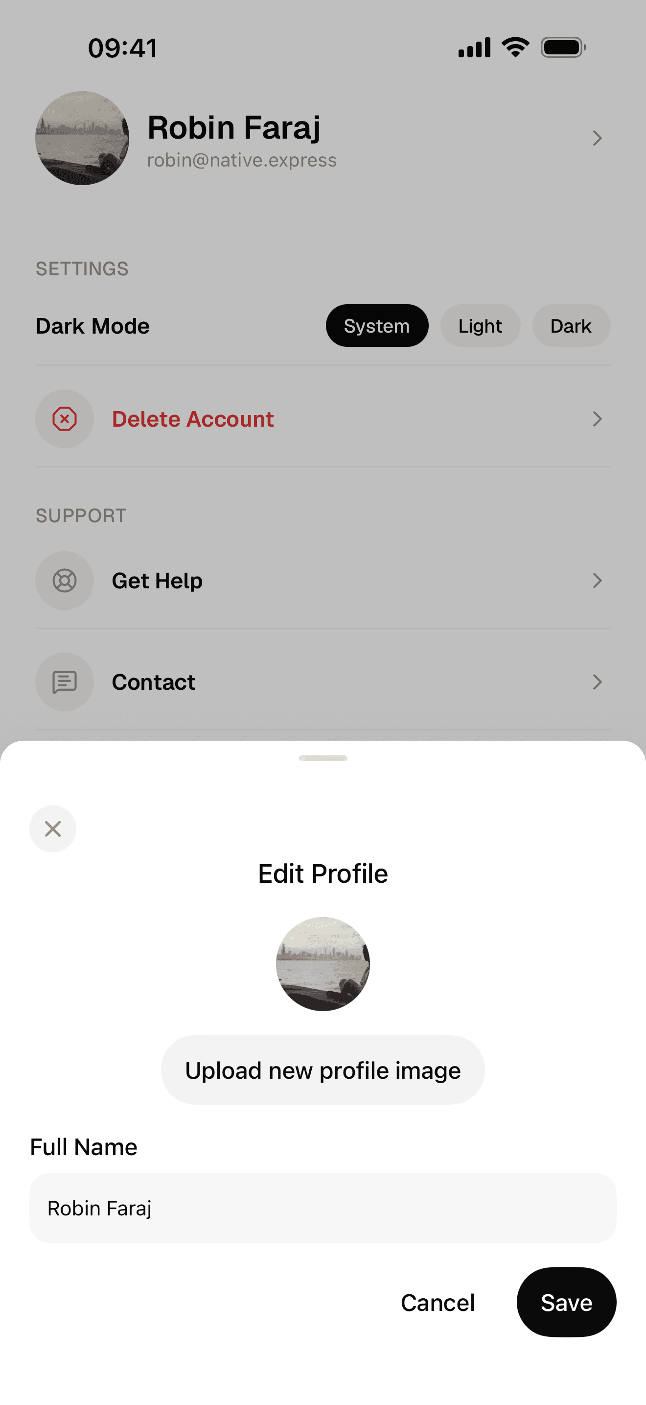
Editing a profile
If your form also needs a select, the React Native dropdown guide covers HeroUI's Select, the native picker and a custom accessible version. And if you want these screens without building them, the React Native starter kit page lists what ships.
FAQ
How do I create a text input in React Native?
Import TextInput from react-native, store the text with useState, and pass it as value while updating it with onChangeText. Add placeholder, an accessibilityLabel and a style. Nothing needs to be installed, because TextInput is a core component.
How do I make a textarea in React Native?
Set multiline on a TextInput, give it a minHeight, and add textAlignVertical="top" so Android starts the text at the top like iOS does. Use maxLength for a character limit and maxHeight to stop it from growing indefinitely.
How do I get the value of a TextInput in React Native?
Keep it in state through onChangeText, which gives you the current string on every change. For forms with several fields, React Hook Form's Controller holds the values, and handleSubmit passes them all to your submit function at once.
What is TextInput in React Native?
TextInput is the core component for typing text with the on-screen keyboard. It renders a native UITextField or UITextView on iOS and an EditText on Android, and its props control the keyboard type, autofill, secure entry and what the return key does.